Seattle Storm rebrand with a new logo
The Storm change things up for a new era of Seattle basketball
On Tuesday, March 2nd, 2021, the Seattle Storm unveiled a brand new logo as they prepare to begin their 22nd season fresh off the franchise’s fourth WNBA title that they won during the 2020 season.
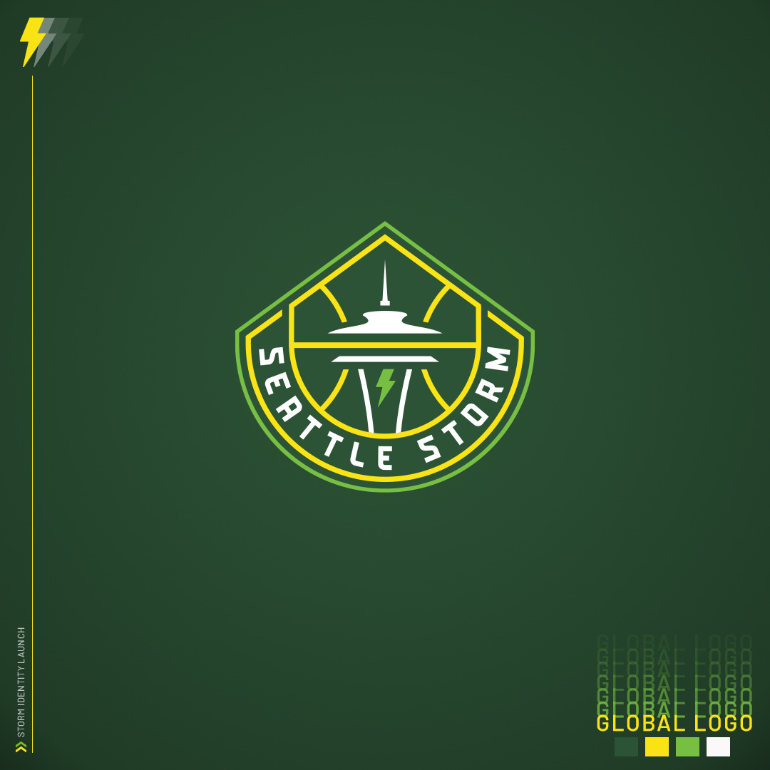
The new logo is a unique blend of Mount Rainier, a basketball, the Space Needle, and a lightning bolt for good measure. This is the first major rebrand for the Seattle Storm in their 22-year history.
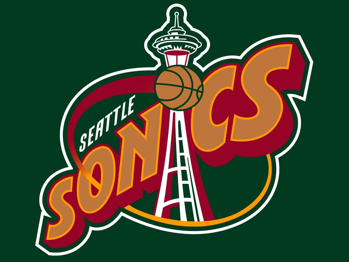
The original logo was based on the Seattle SuperSonics logo of the 1990s. When the Storm became a WNBA franchise in 2000, they were owned by the Ackerley family (Barry and Ginger) who also owned the Sonics.
You can see the similarities between the two logos.
The original logo was used for the team throughout their first 16 seasons between their inaugural 2000 season through 2015, Jewell Loyd’s rookie year. The team won two championships during this logo’s era in 2004 and 2010 behind the dynamic duo of Lauren Jackson and Sue Bird.
The Breanna Stewart era coincided with the Storm’s first official logo redesign. Beginning in 2016, the Storm’s logo changed albeit just slightly. The team’s logo received an overhaul to its color palette, removing the red and orange for neon yellow and gray clouds.
The updated logo was Seattle’s logo for five years between 2016-2020, including the Storm’s third and fourth championships in 2018 and 2020. Dominant teams that once again included Sue Bird backed by a core group of Breanna Stewart, Jewell Loyd, Natasha Howard, Alysha Clark, Sami Whitcomb, and Jordin Canada.
The green and yellow colors brought back the more traditional color scheme when you think of Seattle basketball. The Sonics carried the green and gold (yellow) colors for 27 of their 41 years in the Emerald City. Including 20 seasons with the infamous Seattle skyline logo.
The Storm’s logo will usher in a new era of Storm basketball. The team is getting younger after losing Alysha Clark (Free Agency), Sami Whitcomb (Trade), Natasha Howard (Trade), and Crystal Langhorne (retirement).
Despite re-signing Sue Bird (40), Epiphanny Prince (33), and adding 15-year veteran Candice Dupree (36) in the offseason, the team is heading in a more youthful direction. The team acquired Katie Lou Samuelson (23) and Mikiah Herbert Harrigan (22) through their trade of Natasha Howard (29) to the New York Liberty. With Howard out of Seattle, expect Mercedes Russell (25) and Ezi Magbegor (21) to get the majority of the minutes at the Center position.
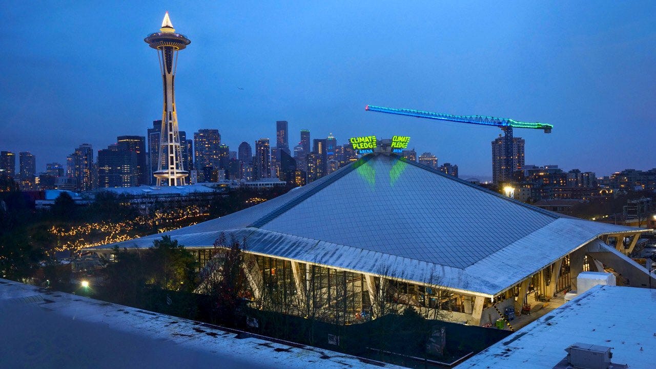
The rebranding will also play a big role with Seattle’s new arena that is currently being constructed. Where KeyArena once stood, Climate Pledge Arena will stand at some point later this year. Originally scheduled to open prior to the 2021 WNBA season, the new arena is now scheduled to open in the Fall. If the Storm are able to make another deep playoff run this season, we’ll likely get our first experience at the brand new facility during the 2021 postseason. Otherwise, it’ll be up and running and ready for the 2022 WNBA season.
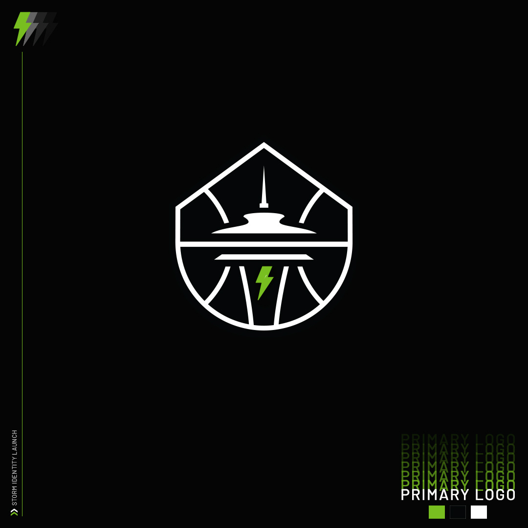
The new logo was revealed in two forms, the Global logo at the top of this article and the Primary logo seen below that removes the “Seattle Storm” lettering and extra border. My initial reaction is that I prefer the “Primary Logo” without the letters because the basketball shape of the logo is more apparent without the extra border which some people have compared to a baseball diamond.
I think for a lot of fans the changes will take some getting used to. Whenever a team has a logo for 20 years any change to that can be difficult to accept right away. But overall, I approve. And from what I’ve read, it seems the majority of fans are on board with the new design. From a quick glance, I’d say there’s a 70% favorable opinion on the new logo and that’s a win for any brand making a drastic change to their identity.
The Storm have announced that on Wednesday, March 3rd that guards Sue Bird and Jordin Canada will raise a flag with the new logo at the top of the Space Needle at 2:00 PM.
The team also announced that a mural will be painted by Mari Shibuya and Zahyr to honor the Seattle Storm’s championship as well as the team’s focus on social justice issues including Black Lives Matter and the “Say Her Name” campaign. The mural will be located about one block away from Climate Pledge Arena in the lower Queen Anne section of Seattle.
What do you think Storm fans? Feel free to sound off in the comments section below!


I think both logos are pretty boring with the primary logo being especially so. I’ll stick to my old merch, I guess.